CELLTTS Logo
Recently I did logo for the upcoming conference
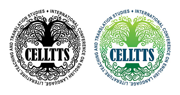
1st CELLTTS
First International Conference on English Language,
Literature, Teaching and Translation Studies
organised by the Department of English Language and Literature
at the Faculty of Philosophy, University of Sarajevo.
I had two solutions, one following a more contemporary design with clear line, shadows and ability to be played with in different forms and materials, and this one, more old school, illustrated logo. The basic idea was the following concept that organizers had in mind when they formed abbreviation for the conference name, CELLTTS that could be read as the Celts (/ˈkɛlts/ or /ˈsɛlts/). This gave me more material to work with. So I borrowed the symbol of Tree of Life from the Celts culture. The idea of Tree of Life is life cycle, for its branches are intertwined and form its roots. This perfectly fits to contemporary approach to language studies, where language is not solid and stagnant, but alive and ever evolving, where its branches always become roots for new forms.
Another thing is that logo itself now is more alive, more vibrant and that is what I wanted to achieve. Tree of Life has been hand drawn on plain paper and traced by regular black ink. I kept all mistakes and irregularities that computer driven designer in me wanted to clean, therefore keeping all randomness that life brings.